

Madesto
-
Posts
7 -
Joined
-
Last visited
Content Type
Profiles
Blogs
Forums
Gallery
Pipeline Tools
3D Wiki
Plugin List
Store
Downloads
Posts posted by Madesto
-
-
26 minutes ago, Cairyn said:
Now that is pretty much ridiculous, as Cineversity is for subscribers only and has no additional fee (and there is no way for non-subscribers to join). So, that training material in the worst case becomes irrelevant or has to be redone (without making additional money from it, but causing cost). And training videos from other vendors don't bring Maxon any money. And in-person trainings will use the newest interface anyway. Not to mention that you don't really need a special training video; you can just watch the R25 release videos. And if you already did a training in C4D, you will hardly buy another just because of some GUI changes. Come on.
Are you sure that cinevercity will be updated?, With the new Maxon policy, I'm not. Old Cinema 4d tutorials for new users will not work. And lessons on R25 can be launched on a new, paid site. Simple business model.0 -
I think the interface change is a purely commercial story. After the redesign, you can re-release all training materials for a fee and earn money on this. "Studying the new cinema interface", "Modeling in a new interface", "Motion graphics in R25". Goldmine. You do not think about users, but only how to make more money without making a lot of effort.
0 -
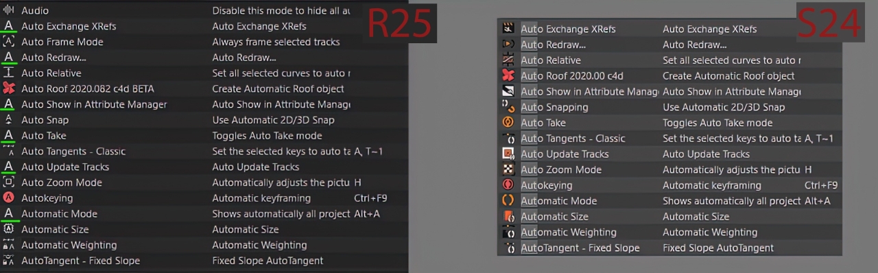
I will continue to talk about new icons:
As I understand the style was taken from Blender and Silo, but you did not take into account that in these applications the number of icons is much smaller, their interface is more "textual". This style imposes a limitation on the variety of icons, so it is not suitable for Cinema 4d, which has a huge number of icons.
Here are some more examples of the new interface:
- Volume and empty polygon have same icon
- Camera and camera deformer have same icon
- Emiter and point selection have similar icons
- Many tag icons have become smaller and less readable, example Tracker tagsThe list goes on and on ...
In Windows 8, Microsoft removed the start menu, then realized that it was a mistake, I hope Maxon understands that changing the icon style was a mistake.


 6
6 -
I think the new icon design is Maxon's failure. Most of the icons are similar to each other, and without textual accompaniment, it is impossible to understand which tool is attached to them.Past icons were more intuitive.
 6
6 -
0
-
Hi Guys
In Cinema 4d s22 i can't select bones in viewport if they under geometry. In a previous cinema 4d version, the bones select normaly.
Have anyone same problem?
0
Cinema R25 Release
in Discussions
Posted
Nobody talks about bad layout, everyone is unhappy with terrible icons.
On page 27 I have attached many screenshots of the comparison of old and new icons and explained why this is so bad, Maxon said nothing. Either a conspiracy theory or horrible unprofessionalism.